Introduction
Color plays a powerful role in branding. The right color choices can evoke emotions, build trust, and shape customer perceptions. Whether you’re creating a new brand or refining your existing identity, understanding color psychology in branding can help you make strategic design decisions that strengthen your brand’s identity and influence customer behavior.
This guide will explore how different colors impact emotions, how industries use color psychology, and how you can choose the perfect color palette for your brand. By the end, you’ll have actionable steps to enhance your brand’s visual identity. Moreover, you’ll understand how color can directly influence consumer behavior.
UNDERSTANDING COLOR Psychology in Branding
1. Understanding Color Associations
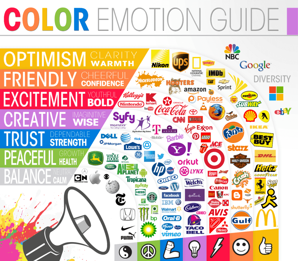
Each color carries psychological associations that can affect how customers perceive your brand. Therefore, choosing the right colors is essential. Here’s a quick overview of what different colors typically represent:
- Red – Passion, energy, urgency, excitement (e.g., Coca-Cola, YouTube)
- Blue – Trust, security, professionalism, calmness (e.g., Facebook, LinkedIn, PayPal)
- Yellow – Optimism, warmth, happiness, attention-grabbing (e.g., McDonald’s, IKEA, Snapchat)
- Green – Health, nature, growth, sustainability (e.g., Starbucks, Whole Foods, Animal Planet)
- Orange – Creativity, friendliness, enthusiasm (e.g., Nickelodeon, Fanta, Harley-Davidson)
- Purple – Luxury, royalty, creativity, wisdom (e.g., Cadbury, Hallmark, Twitch)
- Black – Sophistication, exclusivity, power (e.g., Chanel, Nike, Apple)
- White – Simplicity, cleanliness, minimalism (e.g., Apple, Tesla, The North Face)
By understanding these associations, you can align your brand’s personality with the right colors and create a lasting impression. Furthermore, reinforcing these colors across all branding materials strengthens recognition.
How Different Industries Use Color Psychology IN BRANDING
1. Luxury & High-End Brands
Luxury brands often use black, gold, and deep purples to convey sophistication, exclusivity, and prestige. As a result, companies like Rolex, Prada, and Chanel maintain a high-end feel through their color choices. Additionally, these colors help establish a premium image in the consumer’s mind.
2. Health & Wellness
Green and blue are commonly used in health, wellness, and organic brands because they symbolize nature, tranquility, and trust. Consequently, brands like Whole Foods and WebMD rely on these colors to establish credibility and appeal to health-conscious consumers. Moreover, these colors create a sense of calmness, which is ideal for brands in the wellness space.
3. Tech & Finance
Blue is the go-to color for banks, insurance companies, and tech brands because it builds trust and confidence. For instance, companies like IBM, Dell, Visa, and PayPal incorporate blue into their branding to signal reliability and professionalism. Furthermore, blue provides a sense of stability, which is crucial in these industries.
4. Food & Beverage
Fast food chains often use red and yellow because they stimulate appetite and excitement. This explains why brands like McDonald’s, KFC, and Burger King use these colors to create a sense of urgency and hunger. Additionally, these colors encourage quick decision-making, which is ideal for fast food businesses.
USING COLOR PSYCHOLOGY to Choose the Right Brand Colors
1. Define Your Brand Personality
Before selecting colors, determine what you want your brand to represent. Ask yourself:
- Is my brand playful or professional?
- Do I want to create a sense of luxury or affordability?
- Should my brand feel calm or energetic?
By answering these questions, you’ll gain clarity on which colors align best with your vision. Additionally, defining your personality ensures consistency across all branding elements.
2. Consider Your Target Audience
Your audience’s demographics and preferences should influence your color choices. For example:
- Millennials and Gen Z tend to favor bold and vibrant colors.
- Corporate audiences may respond better to neutral and professional tones.
Since your audience plays a crucial role in brand perception, taking their preferences into account will lead to stronger connections and engagement. Moreover, using audience insights ensures your brand resonates with the right people.
3. Use the 60-30-10 Rule
A well-balanced color palette typically follows this structure:
- 60% Primary Color – Dominates your branding (e.g., background, large elements)
- 30% Secondary Color – Supports and complements the primary color
- 10% Accent Color – Used for emphasis (e.g., buttons, call-to-actions)
This approach ensures balance and consistency across all visual elements. Additionally, it simplifies the design process by providing a structured color strategy.
4. Check Color Contrast & Accessibility
It’s important to make sure your colors are accessible for all users, including those with visual impairments. To achieve this, use tools like WebAIM Contrast Checker to ensure readability and compliance with accessibility standards. Moreover, accessibility-friendly color choices improve usability and inclusivity.
5. Test Your Colors
Experimenting with different shades and combinations before finalizing your palette is essential. Luckily, tools like Canva’s Color Palette Generator and Adobe Color Wheel can help you visualize and refine your color scheme before implementation. Additionally, testing colors on multiple devices ensures consistency in appearance.
COLOR PSYCHOLOGY IN BRANDING: Real-World Examples of Successful Brand Color Choices
1. Coca-Cola: COLOR PSYCHOLOGY IN BRANDING THROUGH The Power of Red
Coca-Cola uses red to evoke excitement, passion, and high energy—perfect for a global beverage brand that thrives on creating emotional connections. Furthermore, red enhances brand visibility and recall.
2. Facebook: COLOR PSYCHOLOGY IN BRANDING BY Building Trust with Blue
Facebook relies on blue to create a sense of trust and security, making it more inviting for users worldwide. Because blue is often associated with credibility, it enhances Facebook’s approachability. Additionally, this color choice supports Facebook’s mission of fostering safe and authentic connections.
3. Starbucks: COLOR PSYCHOLOGY IN BRANDING THROUGH Sustainability and Green
Starbucks incorporates green to align with eco-friendliness and community-driven branding. This makes sense as green reinforces Starbucks’ commitment to sustainability and ethically sourced products. Moreover, green resonates with consumers who prioritize environmental consciousness.
Conclusion
Color psychology is a powerful branding tool that influences customer perceptions and emotions. By choosing the right colors, your brand can establish a strong identity, attract the right audience, and enhance brand recognition.
Next Steps:
- Audit your current brand colors – Do they align with your brand personality?
- Test different color combinations – Use tools like Canva or Adobe Color.
- Stay consistent – Apply your color scheme across all platforms for a cohesive look.
Since color psychology plays such a crucial role in branding, refining your color strategy will help build a stronger connection with your audience. Moreover, a well-executed color strategy increases brand trust and recognition.


